← BlogProduct Releases
Product Update — July 2026: Driver Behavior, Fleet Utilization & Clearer Maps
TJ Chasteen
Welcome to the latest round of Hapn updates. This one is all about seeing more of what your fleet is actually doing — two brand-new reports, a map you can make your own, and an Issues list that finally tells you the whole story at a glance.
Driver Behavior Report
Speeding and harsh events used to live in separate corners of the platform, which made it hard to answer a simple question: who is driving well, and who needs a conversation? The new Driver Behavior Report pulls harsh acceleration, harsh braking, harsh cornering and speeding together into a single view, so you can compare assets side by side without stitching data together yourself.
Speeding severity uses the same tiers you already know from the Speeding Report, so the two reports agree with each other. Every OBD asset is listed — including the clean ones with zero events — because knowing who is doing it right is just as useful as knowing who isn’t.
Fleet Utilization Report
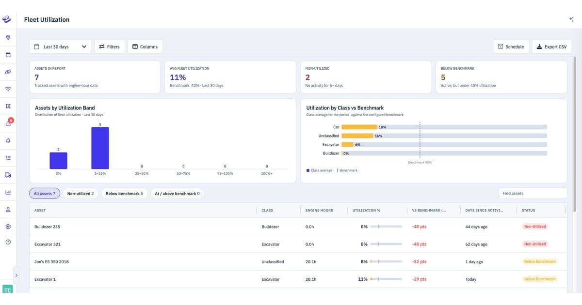
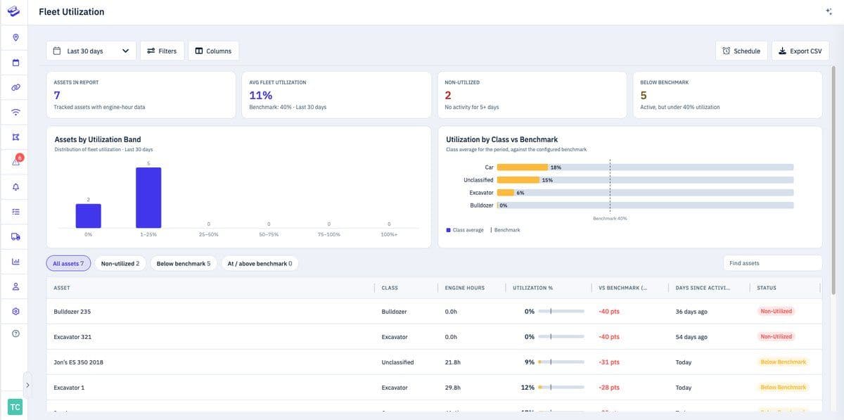
Idle equipment is expensive equipment. The new Fleet Utilization Report shows you which assets are earning their keep and which have been sitting still — not started, not moved, not used — over the period you care about. Set a utilization benchmark and a non-utilized day window, and the report will surface the assets falling below it.
For rental and equipment fleets especially, this turns a monthly guessing game into a straightforward decision: keep it on site, or bring it back and put it to work somewhere else.
Custom Map Overlays
If your operation lives inside one big site — a yard, a campus, a venue, a few hundred acres — the standard base map only gets you so far. Custom map overlays let you lay your own site plan over the live map, so shops, gates, stalls and key locations show up right where your team expects them. Dispatching someone becomes a matter of pointing at the map instead of describing landmarks over the radio.
We covered this one in depth when it launched — if you missed it, read the full write-up here.
Better Map History for Slow-Reporting Trackers
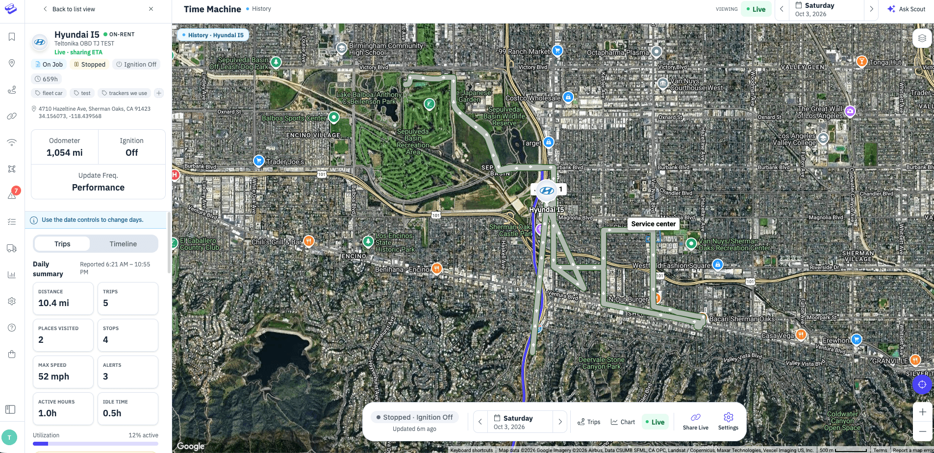
Not every tracker reports every minute. Battery-saving and long-interval trackers update far less often, and drawing a smooth line between two distant points implied a route the asset may never have taken. We’ve changed how the live map and Time Machine handle these assets: instead of a connected line, you now see the actual reported positions as distinct points.
The result is an honest picture — you see exactly where the tracker checked in, without the map inventing the path in between.
Richer Detail in Your Issues List
An issue that says “Low Fuel” is a start. An issue that says how low is a decision. Your Issues list now shows the value alongside the alert — so a low fuel issue reads as “Low Fuel Level · 13%” and a low battery issue shows the exact charge level.
Small change, big difference: you can triage the list top to bottom and know instantly what needs attention right now versus what can wait until tomorrow.
As always, we build these because customers ask for them. If something here is close to what you need but not quite there — or if there’s something missing entirely — we’d like to hear it. Get in touch and tell us what would make your day easier.
Explore Hapn on a live equipment fleet
Click around the real platform — a live mixed fleet with dummy data. No sales call, takes a few minutes.
Volume discounts • No 3-year contracts • Quote in ~24 hours

Get the latest news straight to your inbox.
Share Article
